koay yee ling
Graduates
CONTACT
STRENGTH
Space Planning
SketchUp, 3Ds Max
co-living design
" THE GRASSY AMBIENT HOUSE "

Communal Lounge
CONCEPT STATEMENT
This concept is inspired from the location of the co-living space ‘The Home’ in Penang and is designed with a ‘home’ vibe just like how residents are staying in their own home. Penang is a tropical city which has a great natural view. Thus, the keywords are explored from “nature”. From there, research regarding flowering plants is made; Ixora plants are one of the flowering plants that is easily found in Penang. The shape of Ixora leaves is “elongated”. It is a long-shaped type of leaf. Furthermore, the leaves help the plants to carry out photosynthesis and change light energy into chemical energy. The molecules in the energy have “identical” shapes just like the surface of the leaves. Following with it, the flower of Ixora plants grow in crowded form which shows “dense” in it. Hence, the concept keywords are “elongate”, “identical” and “dense”. In addition, neutral colours such as green, grey and brown have been used as the colours for the interior.

Kitchenette & BBQ Area

Bedroom

Kitchen & Dining Area

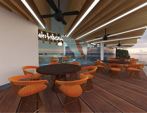
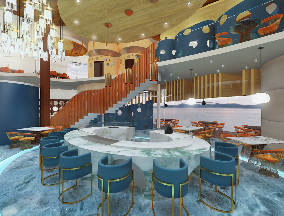
REsTAURANT design
" OVER IN L’OCEAN "

Cashier Counter & Waiting Area
CONCEPT STATEMENT
The concept is inspired from the philosophy of my client, Le Bernardin which is ‘fish is the star of the plate’. Fish is one of the sea creatures that lives in the ocean and they can be classify as two different types: fish and shellfish. Some of the fishes that live in the deep sea are rare to be found. Therefore, “oceanic” has been decided as my first keyword. Furthermore, Le Bernardin serves a lot of seafood such as scallop which has an irregular hard shell-like appearance. Hence, “porous” is the second keyword that has been found related to those kind of creatures. Moreover, by looking into the sea creatures such as corals which had been explored as the third keyword of my project, “spongy”. Besides, complementary colours such as orange and blue are used as interior colours to give the summer ocean vibe for customers. Blue, dark and light orange creates a great combination and represents the colours of sea water and sea creatures respectively.
Outdoor Dining Area
Semi-Private Dining Area