

chong kai xian
Graduates
CONTACT
STRENGTH
Concept Development
SketchUp, Lumion
co-living design
" SALUTE APOLLO "

Mini Lounge
CONCEPT STATEMENT
The design concept is based on the keywords: “radiance”, “streamline” and “cymatics”. These keywords are developed from the co-living space, 52 HERTZ. The concept is named after Salute Apollo, which means appreciating the god of sun. The site is located near the sea therefore the residents of the co-living space are able to enjoy the sunrise and sunset every day. Moreover, it would be like a ceremony between the people and the sun every day. Furthermore, you will figure out that there is a dormer and some sun-looking ceiling designs seen in the perspective. Coral orange, salmon orange and laurel green were applied as the main colours of the interior. This is because these colours are gentle and harmonized with the scenery during the day. During the night, residents will feel warm when staying indoors because the colour scheme is just like the sun. In additionally, warm colours can give a feeling of home to all the residents living in it.

Reading Corner

Lounge Area

Reception
REsTAURANT design
" MOONLIGHT LULLABY "
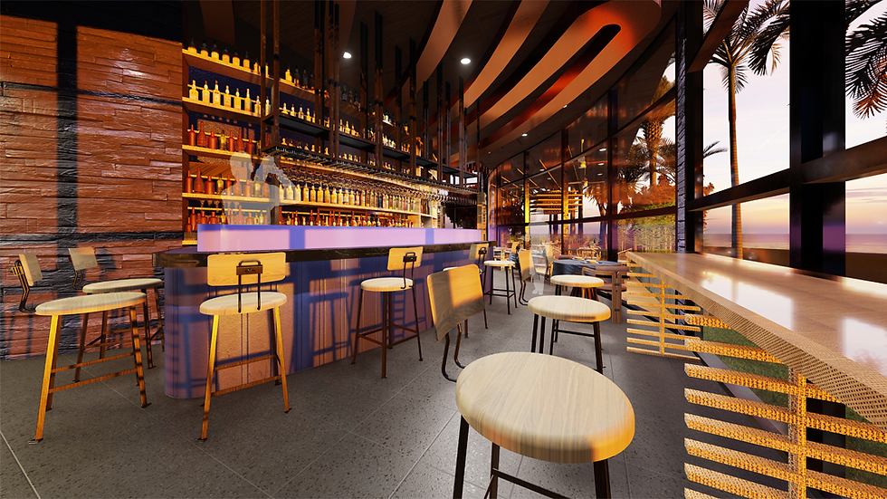
Bar Area
CONCEPT STATEMENT
The design concept is based on the keywords: “irregular”, “vein” and “motion”. These keywords are developed from the client, BAO, the modern Chinese Cuisine and develop even more from the chef, Héctor Jiménez-Bravo and his own products, “Pripravka” pure spices. The concept is named after Moonlight Lullaby because of the French windows that faced towards the seaside. Next, the guests are able to enjoy the beauty of nature such as the moon, the sea breeze and the sound of the waves while having their meal. Furthermore, dark blue and purple were applied as the main colour scheme because the site of this restaurant is near to the sea therefore these two colours are like the combination of the sea and sky during the sunset providing a romantic space for the guests. Furthermore, the dim colour scheme are able to provide the guests a comfort and luxury environment for dining and communicating.

Al-Fresco

VIP Room
