top of page
TOP
13.png

andrea chng

Graduates

CONTACT

STRENGTH

Colour & Material

Sketchup, 3Ds Max

co-living design

" SERENITY THROUGH THE BREEZE  "

ID5-SKY-GARDEN.png
Asset 37.png

Sky Garden Area

CONCEPT STATEMENT

Penang is a heritage area which contains a lot of artwork elements such as street arts and frameworks of heritage housing area. A lot of tourists and youngsters are attracted and fascinated by the artworks so they started to grow interest in it. The main purpose of designing this co-living space named ‘Breezy’ is to create a space where people with same interests can gather to discuss and fulfil their dreams. This is meant to be a personal space to rest our mind after a tiring day of work and a place to socialize with people. Another purpose of having this co-living space is to provide shelter for people with a reasonable price and a minimum of one-year-stay. This co-living space uses contemporary style and calm colours such as white, cream and navy blue to create a clean and leisure surrounding so that they can have a peaceful environment to relax and develop their interests. 

Concept Statement
ID5-DRESSING-AREA.png
Asset 35.png

Dressing Area

ID5-MEDIUM-ROOM.png
Asset 35.png

Medium Room

ID5-LIBRARY&COWORKING-SPACE.png
Asset 37.png

Library & Co-Working Area
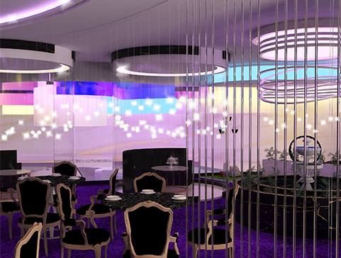
restaurant design

" PETALS OF AURORA "

ID4-OPEN-KITCHEN&PUBLIC-DINING-AREA.png
Asset 37.png

Open Kitchen & Public Dining Area

CONCEPT STATEMENT

This project is mainly inspired from a fine-dining restaurant named ‘Twist’ by Pierre Gagnaire, which provides an extravagant dining experience as well as an oasis of serenity. The design mixes elegant white cracked-eggshell walls and scattered, suspended pearls of illuminated bulbs while 20-feet-high windows overlook the action of the city skyline. It invites guests to dine among the stars as sculptural globe lighting hangs from the ceiling mimicking the whimsical glow of twilight. From the name of the restaurant, I expanded it and extracted keywords which are “fluidity”, “balance” and “rhythm”. As for the colours, I’ll be using cooler tones which are white, blue, purple, gold and black. These represent colours from twilight and auroras. The combination of these colours will express the feeling and glistening effect in the fine-dining restaurant. And when it comes to applying the keywords into the interior, it will be expressed in a curvilinear form yet balanced and has its own rhythm in it. 

Concept 2
ID4-PUBLIC&PRIVATE DINING-AREA.png
Asset 35.png

Public Dining Area 

ID4-FOUNTAIN,PUBLIC&PRIVATE-DINING-AREA.
Asset 37.png

Fountain Area & Semi-Private Dining Area

ID4-OUTDOOR-DINING-AREA.png
Asset 35.png

Outdoor Dining Area

Back to top.

Click to view the full Portfolio.

Asset 28.png

FOLLOW US :

Asset 38.png
Asset 39.png
Asset 40.png
The One Logo

Published on 17 April 2021.

bottom of page